Why I Redesigned My Portfolio in Black and White
By Roberto Sabanal ·
Cover
Article
I recently redesigned my portfolio.
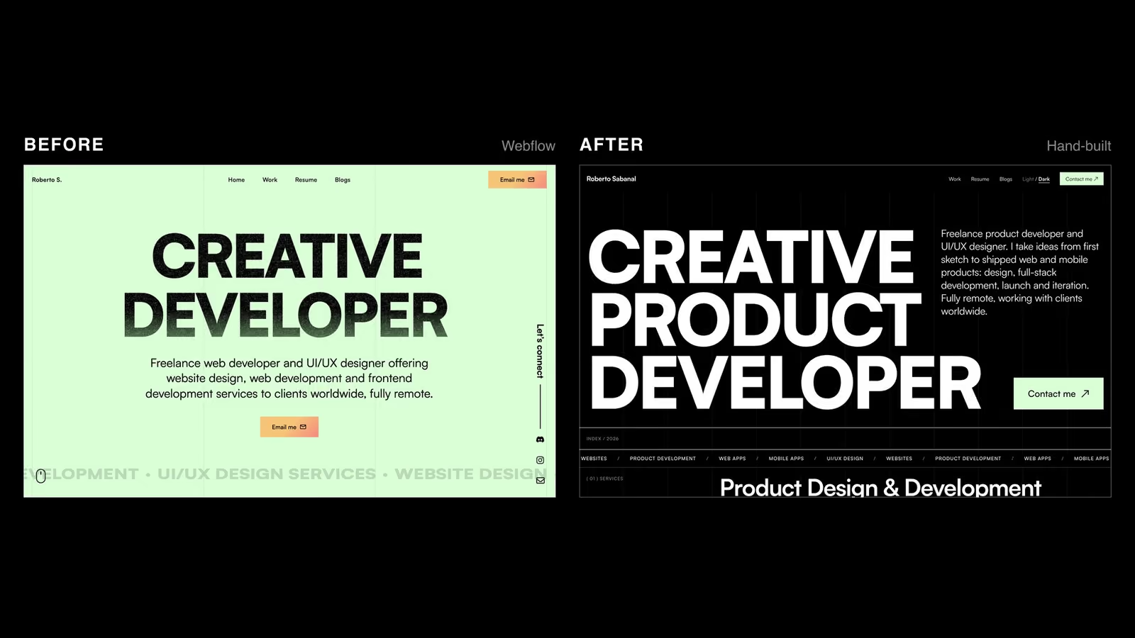
The old version was built in Webflow, with a mint green background and a colorful hero. The new one is plain black and white, built in plain HTML, CSS and JavaScript. You can see both in the image above.
This is why I made the change.
Plain HTML, CSS and JavaScript is easier now
I used to build my own site in a visual builder. Writing everything by hand felt like too much work for a personal project, so I picked the faster option.
That has changed. With Claude Code, building a site in plain HTML, CSS and JavaScript is much easier than it used to be. I don't need a builder or a framework to move quickly, and I get a site that has no extra weight. I wrote about this in The Tools I'd Keep If I Could Only Have Five.
I still direct the design
Claude Code does a lot of the typing, but the design is mine.
I decided what this site should look like: plain, simple, and back to a flat, minimal design. I reviewed the results, pushed back on what didn't fit, and kept going until it matched what I had in mind. The tool speeds up the work. It doesn't decide what the site should be.
Why plain and simple
I've written before about why I choose simplicity in design, and this site follows that idea.
The goal of this website is to inform people about what I can do. It isn't to impress everyone with how it looks.
A portfolio that is trying hard to impress can get in the way of the work it's supposed to show. A plain one lets the reader find what I do, see the projects, and get in touch without being distracted.
One color for the main action
Everything on the site is black and white, with one exception: the call to action.
I kept the mint green for the "Contact me" button because it's the main thing I want a visitor to do. Because it's the only color on the page, it stands out without needing anything else.
Hierarchy comes from size, not color
Without color, I needed another way to show what matters most. I used size.
The biggest text is the most important, and the smaller text supports it. That's why the headline on the home page is so large. You know where to look first, and you don't need color to tell you.
It's a good test for any design. If the hierarchy only works because of color, it isn't strong enough.
Where it ended up
The new site is simpler than the old one, and that was the point. It tells people what I do, shows my work, and makes it easy to contact me.
If you're thinking about redesigning your own site, ask what it's for first. Then remove everything that doesn't help with that.